Slip history the 2004 (Mw 5.9) Parkfield Earthquake
(Single-Plane Model)
Chen Ji, Caltech
DATA Process and Inversion
We revise our preliminary slip model by including the waveforms of 12 1-Hz GPS stations (Contributed by Kevin Choi, Andria Bilich and Prof. Kristine M. Larson of University of Colorado at Boulder) and a close strong motion station, Cholame 5W (CH5W, CISN). 15 GPS vectors distributed by Dr. Nancy King of USGS are also combined into this inversion. We use a 1D velocity structure modified from a 3D velocity structure around Parkfield (Thurber et al, 2003). Green's functions of both static displacement and synthetic seismograms are calculated using the same structure. We also reduce the size of the subfault (2 km (along strike) by 1.45 km (downdip)).
Result
The total seismic moment of our preferred single-plane model is 9.4x10^24 dyne.cm, consistent with point source moment tensor solution. The slip distribution is characterized by two large asperities. One of them is around the epicenter and has a peak slip of 42 cm, larger than the previous result. The other is centered 15 km northeast of the epicenter and has a peak slip about 30 cm. Two asperities are well separated and a large aftershock (ML=5.0) occurred minutes after the mainshock seems to fill the gap. The slip distribution also includes a small asparity 30 km northwest of the epicenter at a depth about 8 km. Because it appears only when the GPS static vectors are included and its subfaults are associated with the longest rise time allowed during the inversion, it may not occur co-seismically. Comparing with the previous result, the near surface slip are better constrained by the GPS stations right above the fault plane.Cross-section of slip distribution
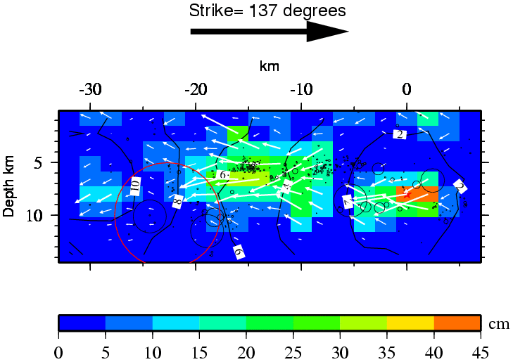
Figure: A big black arrow shows the fault's strike. The color shows the slip amplitude and arrows indicate the motion direction of the hanging wall relative to the footwall. Contours show the rupture initiation time and a red star indicated the hypocenter location. The aftershocks are plotted in black circles whose radius are normalized by its magnitude (10^(ML/2)). The red circle indicates the hypocenter of the 1966 Parkfield earthquake.
Comparison of data and synthetic seismograms
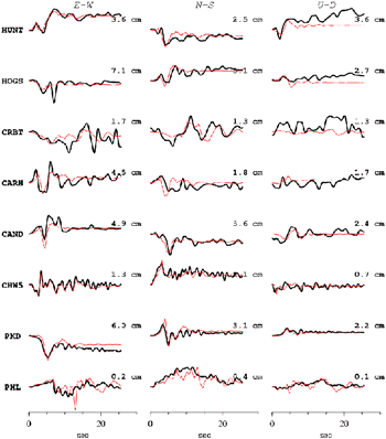
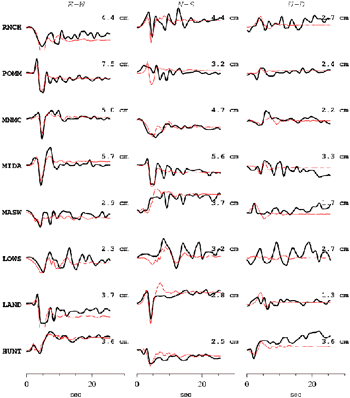
Figure: The Data are shown in black and the synthetic seismograms are plotted in red. Both data and synthetic seismograms are aligned by the P arrivals. The number at the end of each trace is the peak amplitude of the observation in cm.
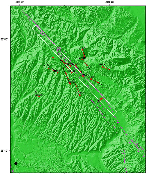
Figure: Comparison of static displacements. San Andreas fault system are plotted in pink and the surface projection of the fault plane is shown by a white box. A black star indicated the CISN epicenter. It is shifted 1.2 km northeast to the red star so that the fault plane could match the trace of the San Andreas fault.
Download (Slip Distribution)
| SUBFAULT FORMAT | CMTSOLUTION FORMAT | SOURCE TIME FUNCTION |
References
Ji, C., D.J. Wald, and D.V. Helmberger, Source description of the 1999 Hector Mine, California earthquake; Part I: Wavelet domain inversion theory and resolution analysis,Thurber, C., S. Roecker, K. Roberts, M. Gold, L. Powell, and K. Rittger, Earthquake locations and three dimensional fault zone structure along the creeping section of the San Andreas fault near Parkfield, CA: Preparing for SAFOD,
GCMT project: http://www.globalcmt.org/
USGS National Earthquake Information Center: http://neic.usgs.gov
Global Seismographic Network (GSN) is a cooperative scientific facility operated jointly by the Incorporated Research Institutions for Seismology (IRIS), the United States Geological Survey (USGS), and the National Science Foundation (NSF).
‹Back to Slip Maps for Recent Large Earthquakes home page
© 2004 Tectonics Observatory :: California
Institute of Technology :: all rights reserved